10/04/2024 • 8 Minute Read
Understanding SwiftUI Basics from a React Developer Perspective
A Comparative Guide to SwiftUI and React: Key Concepts and Differences for Developers

Swift
SwiftUI
IOS
React
App Development
SwiftUI is Apple’s modern framework from developing user interfaces across there different platforms including; iOS, iPadOS, MacOS and more. This article will primarily focus on iOS development, but many of the concepts will be present across the different platforms.
Moreover, there are many similar concepts shared between SwiftUI and the popular Javascript UI framework React. Comparisons between React and SwiftUI will be made to better convey concepts to developers who already familiar with React. However, React itself is also similar to other Javascript UI frameworks such as Vue, Svelte, etc.
Views vs. Components
The equivalent of a React component is a called a View in SwiftUI. Much like how a component is comprised on one or more HTML elements and/or other React components. Swift views are made of one or more other Swift views. Unlike in React, there is no term to define the base, provided components (i.e. HTML elements), as the provided SwiftUI “components” are themselves referred to as views.
Mia created a comprehensive list of the provided, SwiftUI building blocks. The following is a list of HTML equivalents:
| HTML Element | SwiftUI View |
|---|---|
<input /> | Text() |
<img /> | Image() |
<button></button> | Button() |
<textarea></textarea> | TextField() |
<input type="password" /> | SecureField() |
| NA | Stepper() |
| NA | Slider() |
<nav></nav> | NavigationView() |
<hr /> | Divider() |
In React a component instantiated within a component is referred to as a “child component”, and the component that it is contained within is the “parent component”. This terminology is used in swift as well except instead of components there are views.
Javascript UI developers will have noticed that arguably the most import element, the <div> was not included in the table above. This is because the way in which Javascript/HTML frameworks and SwiftUI handle UI layouts is very different, and is covered in the section: “Creating your Application Layout and Style”.
Differences in Instantiating Views and Components
In modern React code, a component is created by creating a Function which returns a value of type JSX.Element or React.ReactNode. Whether the React code is written in Javascript or Typescript, only the function and it’s return value(s) need to be defined, as Javascript is loosely typed and Typescript can infer the type.
To instantiate a view in SwiftUI requires a bit more work, as you need to:
- Import SwiftUI
- Explicitly denote that your custom view uses the
Viewprotocol. A protocol being a set of properties, methods and other requirements aStructrequires to implement certain functionality. - As part of the
Viewprotocol, thebodyproperty needs to be defined and must be of typesome View. The body must contain one or more views within it.
Creating your Application Layout and Style
The way layouts are formed and styled in SwiftUI is very different to JS frameworks. The key distinction which leads to many downstream differences, is that SwiftUI uses Views to style components and layouts, while JS frameworks use CSS which is a it’s own styling language (or abstractions of CSS).
Example: Aligning Three Coloured Boxes
This example will highlight the difference in how you “contain” or “divide” your content and the order in which it can be represented in both HTML/CSS and SwiftUI:
import SwiftUI

struct SquareView: View {
    var color: Color
    var width: CGFloat = 75
    var height: CGFloat = 75

    var body: some View {
        HStack {}.frame(width: width, height: height).background(color)
    }
}

struct ContentView: View {
    var body: some View {
        HStack {
            SquareView(color: .red)
            SquareView(color: .green)
            SquareView(color: .blue)
        }.padding(.vertical)

        VStack {
            SquareView(color: .red)
            SquareView(color: .green)
            SquareView(color: .blue)
        }.padding(.vertical)

        ZStack {
            SquareView(color: .red, width: 175, height: 175)
            SquareView(color: .green, width: 125, height: 125)
            SquareView(color: .blue)
        }.padding(.vertical)
    }
}

#Preview {
    ContentView()
}
type SquareProps = {
color: "red" | "blue" | "green";
width?: string;
height?: string;
zIndex?: number;
};
type SquareStyle = {
backgroundColor: string;
width: string;
height: string;
position?: "absolute";
zIndex?: number;
};
function Square({ color, width, height, zIndex }: SquareProps) {
if (!width) {
width = "75px";
}
if (!height) {
height = "75px";
}
let style: SquareStyle = {
backgroundColor: color,
width: height,
height: height,
};
if (zIndex) {
style = { ...style, position: "absolute", zIndex };
}
return <div style={style} />;
}
function App() {
return (
<div>
<div style={{ display: "flex", gap: "20px", padding: "20px 0" }}>
<Square color="red" />
<Square color="green" />
<Square color="blue" />
</div>
<div
style={{
display: "flex",
flexDirection: "column",
gap: "20px",
padding: "20px 0",
}}
>
<Square color="red" />
<Square color="green" />
<Square color="blue" />
</div>
<div style={{ position: "relative" }}>
<Square color="blue" zIndex={2} />
<Square color="green" width="150px" height="150px" zIndex={1} />
<Square color="red" width="175px" height="175px" />
</div>
</div>
);
}
export default App;The result of the above code snippets are:
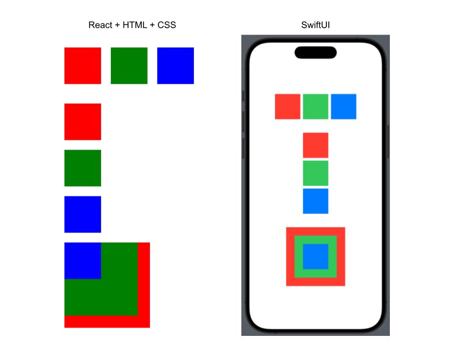
In Swift you can place your child views within a HStack to display them horizontally, VStack to display them vertically or ZStack to display them in front or behind each other. While in React, there is no component that specifically does this. Instead you combine a div which “divides” your content and use CSS styles to make your child elements/components ordered in a particular way. There are many styles you can use to replicate the same functionality, some of which can be applied to the parent component and some on the children component. For this example I opted to use the flex and flex-direction styles to display the squares either in a row or column. However, this cannot be used to replicate the functionality of the ZStack, rather the equivalent in HTML+CSS is add the position: relative style to the parent, position: absolute to the child/children you wish to elevate and the zIndex integer value which determines how far in front or behind an element is placed (e.g. an element with zIndex: 2 will be displayed in front of an element of zIndex: 1).
Finally, the last basic View you can use to contain child views is Group. Unlike the different versions of stack, Group has not default layout/styling. An example of when it would be useful to use Group is when you want to apply the same style modifier to multiple Views, as DevTechie shows this example in his blog:
struct DevTechieGroupExample: View {
    var body: some View {
        VStack {
            Text("DevTechie Courses")
                .font(.largeTitle)
            Group {
                Text("SwiftUI")
                Text("Combine")
                Text("iOS Development")
            }.font(.body)
        }
    }
}
This could be done in HTML/CSS by applying the font-size style to a div that contains text elements.
Differences in Styling
As shown in the previous examples, SwiftUI either uses views with “pre-applied” styling (e.g. VStack) or methods (e.g. .font() or .padding()) to style your application. While in the case of any web development framework the styles are applied to an element using CSS.
While in most cases with CSS, the order of styles applied to a given element doesn’t change the final style of the element. Unless there are duplicate styles or in a small number of cases where certain styles effect different styles.
Handling Application State and Logic
Passing Properties to Child Views
As shown in the previous example of the square, custom properties can be added to a view so we use it in different ways.
React:
function Square({ color, width, height, zIndex }: SquareProps) {
  if (!width) {
    width = "75px";
  }

  if (!height) {
    height = "75px";
  }

  let style: SquareStyle = {
    backgroundColor: color,
    width: height,
    height: height,
  };

  if (zIndex) {
    style = { ...style, position: "absolute", zIndex };
  }

  return <div style={style} />;
}
SwiftUI:
import SwiftUI

struct SquareView: View {
    var color: Color
    var width: CGFloat = 75
    var height: CGFloat = 75

    var body: some View {
        HStack {}.frame(width: width, height: height).background(color)
    }
}
In React the destructured arguments are defined as properties of the prop argument. While in SwiftUI they are simply properties of the custom view Struct.
However, in this example, the values of the aforementioned properties are static (i.e. defined a compile time).
Adding State to Views and Child Views
Both React and SwiftUI provide ways to add “state” to your component, so that a value can change when some event occurs (e.g. button press, text input, API call etc). This state can also be passed down from the parent to the child view/component.
Ben McMahen shows how to do this in SwiftUI with an example of a button counter:
struct IncrementButton : View {
    @Binding var counter: Int

    func increment () {
        counter += 1
    }

    var body: some View {
      Button(action: increment) {
          Text("Increment")
      }
    }
}

struct ContentView : View {
    @State var count = 0

    var body: some View {
        VStack(spacing: 1.0) {
            Text("Press the button below")
            IncrementButton(counter: $count)
        }
    }
}
The equivalent to this in React would be:
import { useState } from "react";

function CounterButton({ increment }: { increment: () => void }) {
  return <button onClick={increment}>Increment</button>;
}

export default function StateExample() {
  const [count, setCount] = useState(0);

  const increment = () => {
    setCount(count + 1);
  };

  return (
    <div>
      <p>Count: {count}</p>
      <CounterButton increment={increment} />
    </div>
  );
}
Both frameworks enable you to split the view or component into seperate files for better code usability and readability.
Best Practice for Complex State Management
The aforementioned approach is not recommended for more complex scenarios. “Prop drilling” is a term used to describe when you are continually passing a property (usually a state or state function) through several layers of child props. This is bad as it “can lead to increased complexity and difficulty in tracking data flow” and can occur in both frameworks.
To resolve this issue, abstracting state and methods that act on stateful variables into seperate modules (functions, classes, files etc) is commonly done.
In React this is typically done by using the inbuilt React Context package or a custom state management solution such as Redux or Zustand. These solutions typically work by having a provider component that encapsulates components that need access to a state store. Moreover, they provide ways to attach custom methods which can update the state of the store.
In SwiftUI a common abstraction to achieve the same functionality utilises the Model-View-View-Model (MVVM) Architecture.
I may write an article comparing MVVM and Zustand or Context in the future. If you would like to see that article when I publish it, you can follow me on Medium! 🙂