29/01/2024 • 7 Minute Read
Why did my Disease Classification Model Achieve 99% Accuracy?
Understanding the Factors Influencing the High Accuracy of a Disease Classification Model in Machine Learning

Machine Learning
Data Science
SciKit
Python
Projects
What is Disease Classification?
Disease classification is the process by which a patient’s symptoms (and other diagnostics such as using an ECG to detect abnormal heart rhythms) can be used to diagnose a patient with a disease.
Another way to think about it is, that given the set of symptoms (and diagnostics) of a patient, what is the likely cause of those symptoms. This is what is commonly referred to as a prognosis.
How can this be Formulated as a ML Optimisation Object?
Using a dataset provided on Kaggle, we can associate a One Hot Encoded vector of symptoms and diagnostics, with a prognosis (the target class). The One Hot Encoded vector simply being a list of booleans, in which the boolean value at every index represents whether a symptom is present or not.
There are many methods and metrics used to evaluate Machine Learning models. The standard metrics being; accuracy, precision, recall (also known as sensitivity) and F1-score.
In the field of medical science and more specifically diagnostics, recall (more commonly referred to as hit rate in medicine), is a very important metric. This is because recall is a measure of how many times a person with a given disease, was correctly identified as having that disease.
In other words, it measures how well a model avoids type II errors (false-negatives). Type II errors, in most cases in medicine are far worse than type I errors (false-positives), as it means a patient may not be given the treatment for a disease. As opposed to a type I, which are more benign and likely to be fixed.
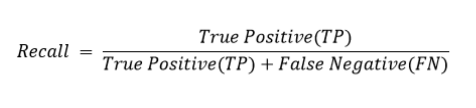
How recall is calculated. Image source: Precision and Recall in Machine Learning.
Today’s CAD (Computer Aided Diagnosis) systems have been shown to achieve up to 90% recall. As such, achieving above 90% recall would be considered a success.
Necessary Assumptions
Given the constraints of the selected dataset, the following assumptions need to made:
- The patient has a disease in our set of diseases.
- All patients have a disease. There is no “no disease” prognosis.
- The patient is only experiencing symptoms in our set of symptoms.
- Making a diagnosis accurately only requires knowing if symptom(s) exist (binary exists or not) and not a metric of its extent/degree.
Exploratory Data Analysis
The dataset used in this project consists of 132 symptom/diagnostic fields and 1 prognosis field (the target class). There are 41 unique diseases stored in the prognosis field. The original dataset was stored in a training and testing csv, which had 4920 and 42 rows respectively. The training set had perfectly balanced target classes, with 120 rows per prognosis. While the test set had 1 row per prognosis, except for fungal infections which had 2 rows.
How Correlated are Symptoms?
The question of how correlated symptoms are is an important to investigate, as it could potentially impact the performance of our model. For example, the Naive Bayes classifier assumes that features are conditionally independent. Hence, if two symptoms were correlated it could imply one is dependent on another and hence violate this assumption, and cayase the classifier to perform poorly.
Evaluating the Correlation between Boolean Variables
There are many methods for measuring correlation between two boolean variables. While Pearson’s correlation can only be used on continuous, numeric data, other measures such as Spearman’s and Kendall’s correlation can work on ordinal variables.
While technically a boolean variable could be considered ordinal (assuming you treat True as a value greater than False), it doesn’t really suit what our symptom variables are measuring.
As such, I choose Proportion of Agreement as measure of correlation, as it is simple and effective for boolean variables.
The Proportion of Agreement is the proportion of times two variables (symptoms) share the same value, as shown below:
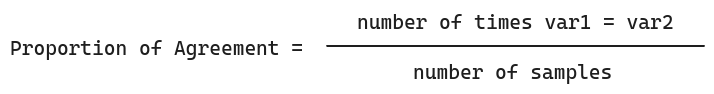
This assumes both variables have the same number of instances/samples.
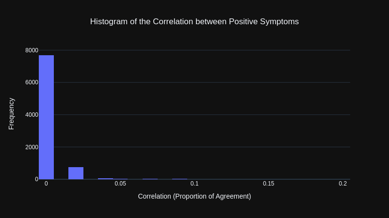
The results from our initial correlation calculations, where that the overwhelming majority of symptoms were highly correlated with other symptoms, as shown by the histogram below.
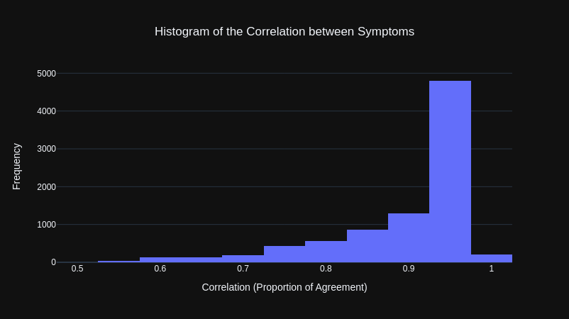
This was puzzling at first as through observation, there appeared to be many symptoms that would not be associated with many other symptoms. However, reviewing the y-data profiling report (a library that automatically generates a data analysis report), it was clear this was because the majority of values for each symptom was False (the symptom being not present, which makes sense given that there are 41 symptoms).
To get a better representation of how correlated symptom pairs were, I instead calculated the Proportion of Agreement for only positive instances of each symptom pair. Meaning that both symptoms would have to be present (both equal to True) to be counted as being in agreement.
The results were that all of the symptoms were not correlated with each other.
To verify this I looked at the symptoms that were most correlated (if the measure was working properly, the symptoms should be medically similar). This revealed the measure was working properly as it included symptom pairs such as fatigue and high feaver as well as vomiting and nausea.
| Symptom 1 | Symptom 2 | Correlation |
|---|---|---|
| fatigue | high_fever | 0.199949 |
| vomiting | nausea | 0.197917 |
| vomiting | abdominal_pain | 0.174797 |
| loss_of_appetite | yellowing_of_eyes | 0.160315 |
| fatigue | loss_of_appetite | 0.156504 |
| vomiting | loss_of_appetite | 0.155234 |
| yellowish_skin | abdominal_pain | 0.154726 |
| vomiting | fatigue | 0.153963 |
| nausea | loss_of_appetite | 0.136179 |
| fatigue | malaise | 0.135163 |
Model Development
Data Cleaning and Preprocessing
The dataset provided required almost no data cleaning as there were no missing values and all of the values were in the correct, consistent format. The only cleaning steps involved:
- Converting the 0s and 1s to boolean values:
FalseandTrue(not necessary but would make more sense in interpretting models later). - Removing empty columns.
The only preprocessing task that was necessary was increasing the size of the test set, as it was less than 1% of the size of the training set. I increased the test set size to 20% of the entire dataset while also ensuring each target prognosis class had the same number of rows in both the training and testing set (to ensure there were no imbalances).
Feature Engineering
Given the simplicity of the features in the dataset, feature engineering wasn’t necessary.
Model Training
The decision tree model was trained and evaluated using two methods; the first being a basic 80/20 train-test split and the second being the more conclusive stratified Kfolds validation method.
As hinted in the title, the model performed very well out of the box, so I didn’t seek to tune hyperparameters using a validation set.
The only custom parameter set was the random state (using an arbitary value), to ensure results were repeatable.
Evaluation
On the train-test split, the decision tree model achieved:
- Test accuaracy: 99.90%
- Recall: 99.91%
- Precision: 99.91%
- F1-score: 99.90%
Initially, I thought these results might have been so high because the model was being overfit on a certain portion of the data. To test this hypothesis I utilised stratified Kfolds cross validation to train and test the decision tree model on different parts of the dataset, to ensure that the model was consistent overall. Furthremore, the “stratified” version of this technique ensures there is an equal number of each target class (each type of disease/prognosis) in each training and testing set. To ensure there aren’t any imbalances in the model training and any biases in evaluation.
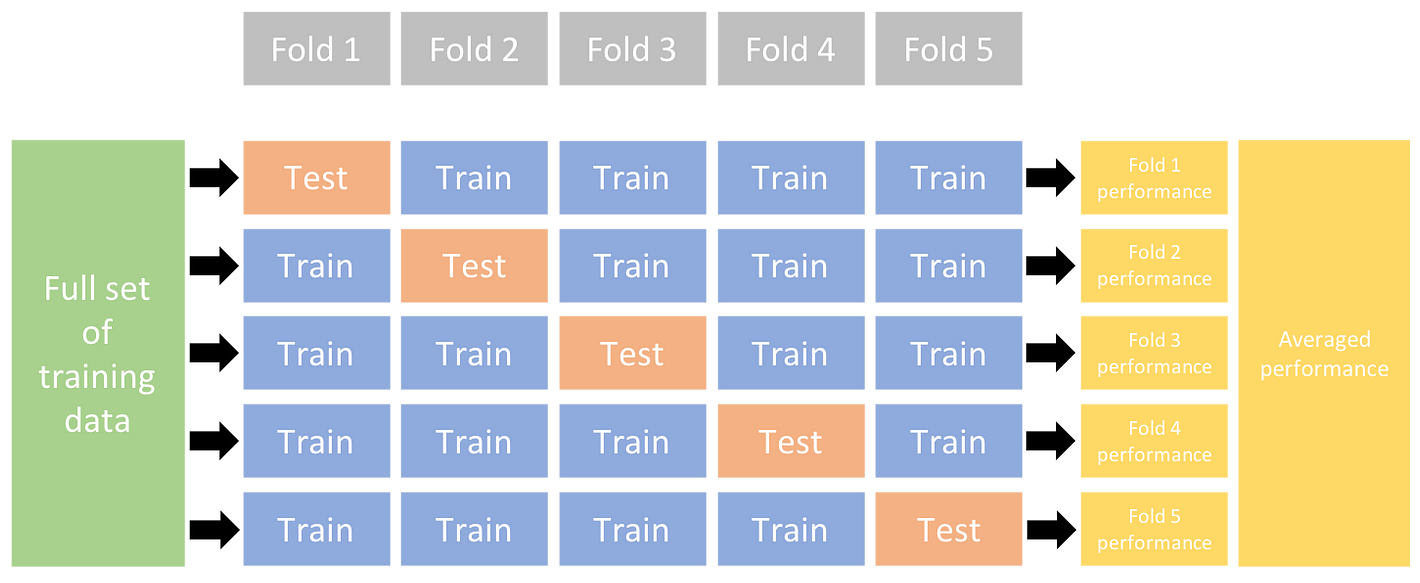
Diagram of how Kfolds cross validation works. Image from Ultralytics.
The number of folds I choose was 10 (arbitary rule of thumb I found through research).
The final cross validation score is the average of the test accuracies from each fold, which for the tree model was: 99.98%.
Why did the Decision Tree Model perform so well?
This degree of performance from a decision tree model, out of the box with no need for hyperparameter tuning or feature engineering seems to be strikingly unusual.
After revisiting the original dataset and furthering the initial analysis, it became clear that the dataset lended itself to being easily interpretable/learnable. The primary reason being, that there were no overlaps between any prognoses, meaning the feature space was quite isolated. An overlap being where a pair of prognoses have the identifical symptom vectors.
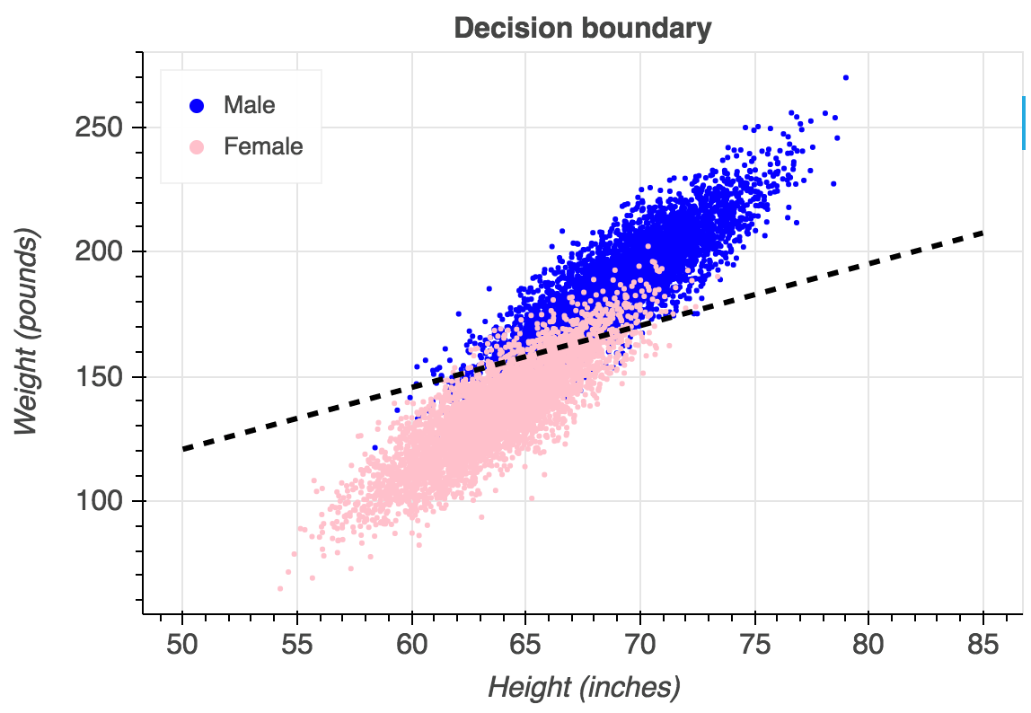
An example of what overlaps between classes would look like on a logistic regression. In our dataset, each side of the line would be a completely distinct colour. Image from Gustavo.
Furthermore, the majority of symptom vectors for all prognoses were duplicates.
These two characteristics of the dataset made the boundaries of each target class easily seperable by the tree model. Hence leading to the great out of the box performance.
GitHub Repository
https://github.com/LGXprod/Disease-Prediction
References
- https://www.kaggle.com/datasets/kaushil268/disease-prediction-using-machine-learning/data
- https://en.wikipedia.org/wiki/Computer-aided_diagnosis#:~:text=Today’s CAD systems cannot detect,a False Positive (FP)
- https://www.ncbi.nlm.nih.gov/pmc/articles/PMC10205571/
- https://stats.stackexchange.com/questions/222924/correlation-between-two-binary-variables
- https://en.wikipedia.org/wiki/Conditional_independence